
Discussão sobre SHOP
Postos
191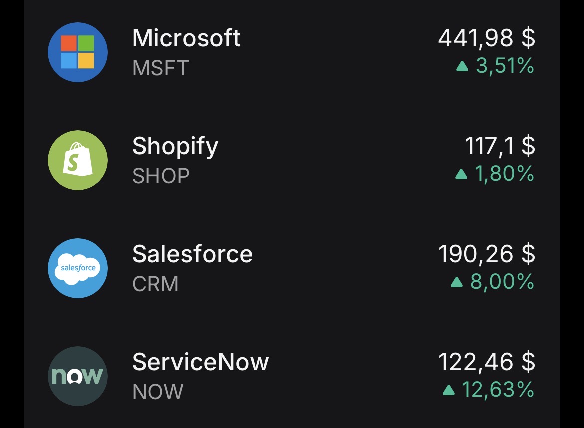


𝐒𝐡𝐨𝐩𝐢𝐟𝐲: 𝐒𝐭𝐫𝐨𝐧𝐠 𝐁𝐞𝐚𝐭, 𝐑𝐞𝐯𝐞𝐧𝐮𝐞 𝐁𝐞𝐚𝐭
📊 𝐑𝐞𝐬𝐮𝐥𝐭𝐬
• Adj. EPS: N/A
• Revenue: $3.17B (Est. $3.09B) ✅
• Operating income: $382M
• Gross profit: $1.55B
• Free cash flow: $476M
⠀
🎯 𝐆𝐮𝐢𝐝𝐚𝐧𝐜𝐞
• Q2 Revenue growth: high-20s% YoY
⠀
📌 𝐊𝐞𝐲 𝐓𝐚𝐤𝐞𝐚𝐰𝐚𝐲𝐬
• Revenue surged +34% YoY with GMV exceeding $100B
• Strong operating leverage with operating income up ~88% YoY
• Free cash flow margin remained solid at 15%
• Broad-based growth across geographies, merchants, and channels
⠀
💬 𝐌𝐚𝐧𝐚𝐠𝐞𝐦𝐞𝐧𝐭 𝐂𝐨𝐦𝐦𝐞𝐧𝐭𝐚𝐫𝐲
“Shopify has entered the AI era with a clear edge… strong, durable growth and two decades of commerce intelligence.”

But keeping me eye on this one !

Quarterly figures 04.05-08.05.26
$NCLH (-1,21%)
$PINS (-1,01%)
$SONO (+0,68%)
$PARA (-4,99%)
$PLTR (+3,03%)
$DUOL
$HSBA (-0,17%)
$UCG (+0,1%)
$BOSS (-0,18%)
$UNI (+0,28%)
$CCO (+0,85%)
$PYPL (-0,67%)
$BNTX (+0%)
$DOCN (+2,31%)
$SHOP (+0,53%)
$ROK (+1,9%)
$RACE (-1,37%)
$PFE (-1,25%)
$ANET (+0,62%)
$TEM (+4,55%)
$AMD (+2,2%)
$EA (+0,28%)
$LITE (+6,65%)
$MSTR (+6,39%)
$SMCI (+0,17%)
$CPNG (-1,07%)
$IFX (+1,54%)
$DTG (+1,55%)
$KOG (+0,5%)
$HFG (-0,91%)
$BMW (-0,88%)
$ZAL (+2,48%)
$CVS (+0,01%)
$UBER (-3,19%)
$OSCR (-2,17%)
$DIS (-0,49%)
$ADYEN (-1,44%)
$DASH (-1,69%)
$FTNT (+3,67%)
$FSLY (+3,3%)
$IONQ (+0,79%)
$SNAP (+0%)
$APP (+0,41%)
$ARM (-6,3%)
$ALB (+1,83%)
$DDOG (+5,08%)
$RHM (-0,76%)
$PTON (+1,69%)
$MCD (-1,61%)
$SHEL (+0,45%)
$WULF (-5,82%)


Understanding multiple expansion
Reading time: approx. 3 - 4 minutes
Anyone who buys a share and expects a return first thinks of profit growth. The company earns more, the share price rises. This logic is correct, but it only explains part of the reality.
A second lever often has just as strong an effect: multiple expansion. In simple terms, the share price can be broken down into profit multiplied by the multiple. Returns are therefore generated either by rising profits, by a rising multiple, or by both at the same time. The multiple does not rise because more is earned, but because the market is prepared to pay more per unit of profit.
Three factors regularly drive this.
1. change of narrative. If a company is reclassified by the market, the willingness to value it changes.
A cyclical industrial group suddenly becomes a platform. A hardware manufacturer becomes a software company. The decisive factor here is not the narrative alone, but that the market expects a structurally higher quality of cash flows: more growth, better margins, less cyclicality. $MSFT (-1,69%) is perhaps the cleanest example. Under Steve Ballmer, Microsoft was seen as a stagnating Windows company with a P/E ratio of around 10 to 12. Satya Nadella repositioned the company as a cloud platform. The multiple multiplied, but not blindly: Azure growth and margin improvement provided visible confirmation early on. Story and fundamentals picked up together.
2. interest rates. Lower interest rates increase the present value of future profits.
More precisely: the total discount rate, i.e. the risk-free interest rate plus the risk premium on equity, is decisive. Growth stocks react more strongly to this than the market average because their profits lie further in the future. The longer the term of the expected cash flows, the greater the interest rate effect on the valuation. 2022 was a real-time test of this: When the Fed aggressively raised interest rates, highly valued growth stocks such as $PYPL (-0,67%) or $SHOP (+0,53%) fell massively in value. The discount rate effect was dominant, even if operational disappointments were also a factor in both cases.
3. risk perception. When the market perceives a company as safer, the perceived uncertainty of cash flows decreases.
Lower equity costs justify a higher multiple without anything having changed operationally. At $AMZN (-0,23%) this was observed when AWS was reported separately for the first time. Investors recognized that there was a highly profitable cloud segment behind the low-margin trading business. The Group's risk profile was reassessed. The multiple increased.
$NVDA (+3,56%) illustrates multiple expansion better than any textbook example, but with an important nuance. At the end of 2022, Nvidia was trading at a forward P/E of roughly 30 to 40. Then came ChatGPT. Suddenly, investors no longer saw Nvidia as a graphics card manufacturer, but as an infrastructure provider for artificial intelligence. The multiple climbed sharply.
At the same time, earnings estimates exploded. $NVDA (+3,56%) This is therefore not an example of pure multiple run-up, but of the ideal case: narrative change, earnings revisions and multiple expansion occurred simultaneously. All three levers pulled together.
$META (+0,13%) shows the other side. In 2022, the multiple collapsed from around 25 to less than 10. The market no longer believed in the metaverse, feared a structural decline in the advertising business and saw billions disappear into reality labs. Profits fell and the multiple shrank. Double compression.
What followed was re-rating in its purest form. Mark Zuckerberg announced the "Year of Efficiency". Costs were massively reduced and the company reprioritized. Profits recovered quickly. The multiple rose from below 10 to over 25.
Who $META (+0,13%) bought at the end of 2022 or beginning of 2023 caught a rarely clean pattern: profit recovery plus re-rating. Both levers at the same time.
This leads to an uncomfortable truth. The multiple itself is not an independent force, but a function of growth expectations, interest rates and perceived cash flow quality. What cannot be reliably predicted is not the multiple, but how expectations and narratives shift. The market can read the same quarterly figures as confirmation or disappointment, depending on what it has previously priced in.
What you can do is recognize when the multiple is already pricing in a lot of optimism and assess whether the narrative supports it. A P/E ratio of 70 for$NVDA (+3,56%) needs sustained high earnings growth to remain justified. If the multiple compresses to 40 without a drop in earnings, the revaluation alone creates a significant headwind of over 40 percent. This has not happened. $NVDA (+3,56%) has grown into the valuation.
In my view, multiple expansion is more of an observation than a strategy. You can see it more clearly in the rear-view mirror than through the windshield.
The next article turns the question around: What happens when the multiple barely moves? When is pure earnings growth enough to deliver exceptional returns? $AMZN (-0,23%) has shown over two decades that this is possible.


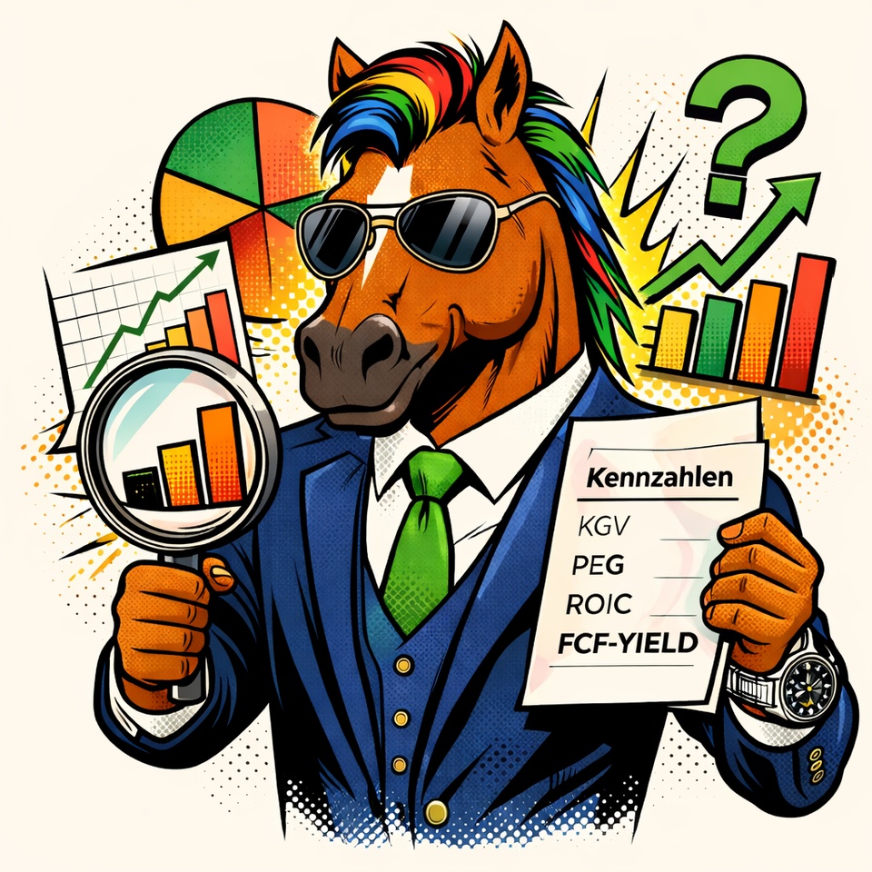
Part 10 - Why key figures fail without an evaluation framework (conclusion of the series)
Reading time: approx. 4–5 minutes
Over the past few weeks and months, I’ve written a lot about financial metrics: P/E ratio, ROIC, FCF yield, PEG, and the Rule of 40. At the same time, I’ve covered interest rates, liquidity, market phases, multiple dynamics, volatility, and fiscal policy.
Today, I’d like to bring it all together.
For me, the key takeaway from this entire series isn’t a single metric. It’s something more fundamental: metrics only reveal their true value within the right valuation framework. Without context, they’re precise—but not necessarily meaningful.
Ratios measure conditions. Markets trade on expectations.
The price of an asset is determined by the present value of expected future cash flows. Historical earnings, margins, or cash flows serve as important reference points. But they are not the future—they are only part of the information base.
A P/E ratio of 30 is neither automatically expensive nor automatically cheap. It is, first and foremost, a ratio of price to earnings.
Whether 30 is high or low depends on interest rates, growth expectations, risk appetite, and the business model. In an environment of low real interest rates, higher multiples make more sense because the discount rate is low. If interest rates rise structurally, this logic changes. The same earnings are discounted more heavily—the multiple declines, even if everything remains stable from an operational standpoint.
For $MSFT (-1,69%) (Microsoft), a higher multiple may be plausible as long as returns on capital remain well above the cost of capital. If the cost of capital rises, the economic leeway narrows. The company remains strong in qualitative terms—but its valuation reacts to the broader context.
With $NVDA (+3,56%) (NVIDIA), we see how an investment cycle in AI infrastructure can support a phase of multiple expansion. If growth or investment momentum normalizes, perceptions change. The multiple suddenly seems more ambitious—even though the metric itself appears unchanged.
Or take $XOM (-0,17%) (Exxon Mobil). During a period of high prices, a high FCF yield can emerge. That looks attractive. But commodities are cyclical. Peak cash flows are often unsustainable. The metric is accurate—its interpretation depends on the cycle.
In this series, I have therefore presented a four-phase model: build-up, acceleration, euphoria, and peak. Not as a rigid framework, but as a guide for interpretation.
Revenue growth of 20% can be viewed very positively in an early phase. In a late phase, the same figure may be perceived as insufficient. The metric remains the same; the context changes.
The PEG ratio, too, is only as good as its assumptions. For $SHOP (+0,53%) (Shopify), a normalization of growth can worsen the PEG without the business model being structurally compromised. Forecasts are always subject to uncertainty.
A particularly key point is the relationship between return on invested capital (ROIC) and the cost of capital.
An ROIC of 15% sounds strong. If the cost of capital is 14%, there is hardly any economic value added. An ROIC of 12% can be significantly more attractive if the cost of capital is 6%. What matters is the spread—not the isolated figure.
At the same time, precision remains important. A structured valuation model helps make assumptions transparent. Sensitivity analyses show how strongly valuations react to changes in interest rates or margins. Problems arise only when the apparent precision of the output figure masks the uncertainty of the input assumptions.
The overarching insight is therefore this: Numbers are necessary, but not sufficient.
An investor without key metrics loses their bearings. An investor with key metrics but without a valuation framework runs the risk of developing a false sense of security. Quality arises from the interplay of quantitative analysis, macroeconomic understanding, awareness of business cycles, and business model analysis.
The question of whether the P/E ratio is 28 or 30 is not decisive in the long term. What is more important is the market environment in which we operate. Which phase dominates? How are interest rates and liquidity evolving? Is the ROIC sustainably above the cost of capital? How sensitive is the valuation to changes in assumptions?
This series began with interest rates and liquidity. It moved on to market phases and valuation mechanics, and then to individual key figures. If I were to summarize everything in one sentence, it would be this: Ratios are tools. The valuation framework is the architecture within which they are meaningfully applied. Context enhances the significance of ratios. Context structures precision.
If we take this line of thinking further, the question arises as to what the next logical steps are. Here are four possible directions for the next series:
1. Decision-Making Architecture in the Portfolio
How do I define entry zones based on scenarios? How do I determine position sizes depending on uncertainty? How do I handle winners like $MSFT (-1,69%) (Microsoft) that are ambitiously valued but remain structurally strong?
2. Valuation Mechanics & Sources of Return
What drives long-term performance? How much of the return for $AMZN (-0,23%) (Amazon) comes from earnings growth, and how much from changes in multiples? When does earnings growth dominate, and when does valuation adjustment?
3. Cyclical Investing Without Market Timing
How do I distinguish between $XOM (-0,17%) (Exxon Mobil)? What role do earnings revisions play? How do different sectors perform in various phases?
4. Quality vs. Valuation
When is a valuation premium justified for high returns on capital? When is quality systematically overvalued? How long can spreads between ROIC and the cost of capital realistically persist?
I’d be interested in hearing your thoughts.
Which of these four areas would you prioritize? Or is there a completely different topic we should explore in more depth?


How you can better assess the risk of AI in Shopify and other stocks
Once a celebrated shooting star, now in the crossfire of the AI debate. Is the winning streak of Shopify in danger?
The flag may fly again tomorrow
Shopify belongs to a group of Aktienwhere the narrative changes completely at irregular intervals.
There were times when the company was seen as an alternative to Amazon as an outdated and unprofitable problem candidate, at times no price could be too high, then none too low.
In the last 2-3 years, the share has experienced a renaissance. The operating successes were remarkable and the share price increased almost tenfold.
For some time now, however, a new narrative has emerged and the share has come under significant pressure.
The stock market is currently dominated by one topic. There is growing concern that traditional software providers and SaaS platforms such as Shopify will be replaced by new, KI-focused competitors or alternative technologies.
This debate has led to a veritable "bloodbath" in the software sector. With share price losses of just over 30%, Shopify has come off relatively well compared to many other companies in the sector.
I will spare you the debate about possible disruption at this point. We have already examined this topic in detail using a number of other examples.
There is a certain risk of disruption for almost every company, and this risk has always been above average in the software sector, as small teams of developers repeatedly bring outstanding products to the market - in case of doubt, a single brilliant mind is enough.
Understanding disruption risk: Checklist for investors
However, it may be helpful if I provide you with a checklist that you can use to assess the risk of disruption for companies.
Factors that can Risiko can reduce the risk:
- A fundamentally high level of customer loyalty and a strong contract commitment.
- High switching costs for customers (monetary, training, data migration).
- Deep integration into the customer's existing IT landscape or work processes.
- Customer loyalty through a community, ecosystems, data, networks or additional services.
- The software is a core component of critical business processes.
- High dependency on company-specific data.
- Customizing / tailored workflows and applications.
- Complexity of core functions (difficult to replicate using AI).
- Proprietary algorithms or models.
- High regulatory hurdles in the background.
- Regulated industries / safety-critical software.
- Long project durations for customers.
- Exclusive database / first-party data.
- Strong brand / market leadership.
- Unique selling points that are difficult to copy.
- Highly specialized solutions.
- Integration of AI in own offerings.
On the touchstone
These are the first points that come to mind. In essence, it can be summarized as follows:
The deeper the software is integrated into the customer's work processes and the higher the switching costs, the less likely disruption is. The lower the potential savings, the less interesting a change is.
The risk is particularly low if the software provider can offer an exclusive database or network, as this cannot be copied.
In contrast, the risk of disruption is particularly high when it comes to standardized and interchangeable products. Especially open, easily reproducible functions or low-code.
The hardest hit could be software that has previously performed tasks that can be automated by AI. Such systems could effectively become obsolete.
What does this tell us about Shopify?
Anyone evaluating Shopify on the basis of the previous list, which by no means claims to be exhaustive, will come to a mixed conclusion.
Shopify's customer loyalty is high for a number of reasons and so are the switching costs. Anyone who has ever switched a website from one system to another knows what I'm talking about.
Many merchants use Shopify for core processes such as order processing, warehouse management, payment processing. Payments, taxes and issues such as legal compliance require a stable platform and trust - this cannot be replicated overnight.
In addition, Shopify's range of services is so large that it would be very difficult for an AI startup to copy everything.
On the other hand, it can be argued that new AI providers could put a strain on new business in the future.
For example, if you look at how quickly you can create websites and online stores with the help of AI, the question naturally arises as to whether this will have a negative impact on Shopify's growth.
The same applies to marketing campaigns and other individual features. Shopify customers don't have to move their entire store to the competition. It is enough that individual services are no longer used and are replaced by other providers.
Shopify is booming
Countless AI start-ups are working day and night to make life difficult for Shopify. But this is nothing new, it's been a matter of course since the launch of ChatGPT in 2022 at the very latest.
If you look at the business figures, Shopify's competitors have not been successful so far,
In the time since AI has become ubiquitous, Shopify has significantly increased its revenue from USD 7.06 billion to USD 11.56 billion.
Free cash flow has more than doubled from USD 0.94 to USD 2.15 per share.
No problems were evident in the financial year just ended. At the bottom line, sales increased by 30% to USD 11.56 billion and the operating result by 36% to USD 1.47 billion.
Free cash flow improved by 26% to USD 2.01 billion.
The value of all goods and services processed via Shopify's systems climbed to the impressive sum of USD 378.4 billion in 2025 (compared to USD 292.3 billion in the previous year).
There was also no sign of a slowdown in growth momentum over the course of the year. In the final quarter, growth amounted to 31%.
The operating result rose disproportionately, which also indicates that Shopify is still able to hold its own against the competition.
First cracks?
The only blemish is the FCF margin, which fell slightly from 18% to 17% in the last financial year.
Shopify attributes the decline primarily to increased investment in AI tools and platform development to secure future growth.
The much bigger problem, in my view, is that this trend could continue.
For the first quarter, Shopify is forecasting an increase in revenue in the "low 30 percent range", i.e. continued high growth.
However, gross profit is expected to increase at a somewhat slower rate, in the "high 20 percent range".
The FCF margin should even fall slightly over the course of the year
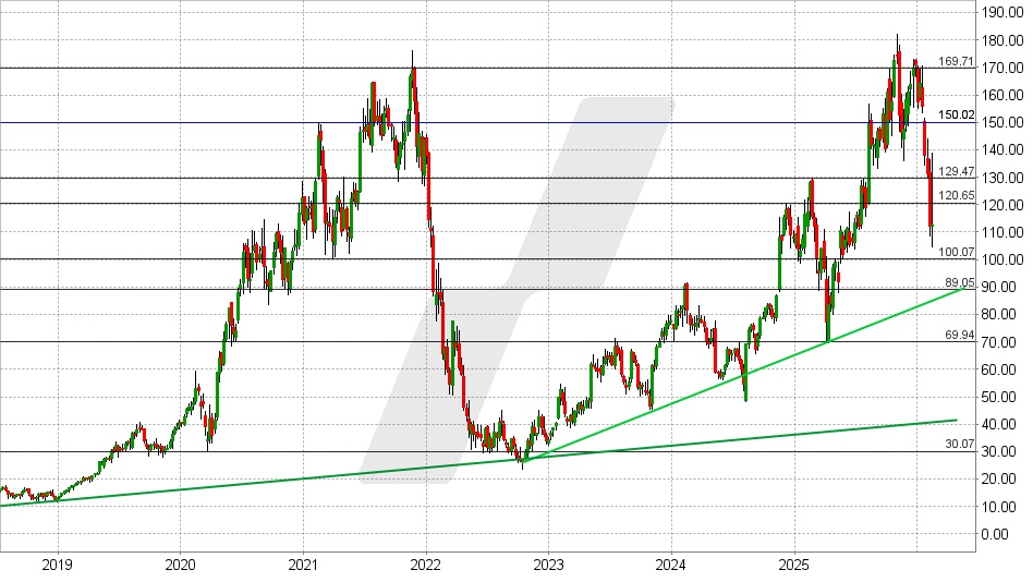
Shopify share: Chart from 16.02.2026, price: USD 112.70 - symbol: SHOP | source: TWS
Changes on this scale should not be overestimated, but it could be a first sign that competition has become tougher.
It is equally possible that this is not due to external effects, but simply to the fact that the Merchant Solutions segment is currently growing faster than the even more profitable Subscriptions Solutions division.
According to consensus estimates, FCF is likely to increase by 32% to USD 1.87 per share in the current financial year.
Shopify therefore has a multiple of 60 and is therefore unlikely to be an option for many investors.
However, it is also true that Shopify has almost been Börsengang just over ten years ago, Shopify has been valued almost consistently higher.
The same applies to other Kennzahlen. The P/E ratio is currently 12.3, for example. The long-term average was 17.7 and the average over the last five years was 16, despite the share price collapsing in the meantime

Only the design of the stores can be generated by AI, but Shopify is also working on such tools itself. Shopify itself is also investing a lot of money in the development of these AI tools and this naturally also influences the share price. The investments are risky in the short term, but Shopify also has an opportunity to monetize the tools, namely via new premium models that contain AI functions. This opens up new potential for profit increases in the long term.
So I continue to buy :)

Trade Republic - Exemption order exhausted? Incorrect
I'm a bit confused right now.
At the beginning of the year, my €1000 exemption order was reset to €0 (as usual). So far everything is normal.
So far this year I have:
- a larger partial sale → $SHOP (+0,53%) with a profit of around €350
- a few dividends → under €150 in total
- I have even sold 4 positions in the red $MCD (-1,61%) & $7974 (-0,23%) & $LOTB (-0,09%) & $QDV5 (-0,62%) (about 150€ minus)
Means: I should be somewhere around ~350-400 € usage.
Nevertheless, Trade Republic shows me that my exemption order has already been exhausted.
In addition, I notice:
➡️ For about two weeks now, capital gains tax has been withheld on all dividends, as if the exemption amount had been completely used up.
This cannot be mathematically correct.
Have you ever experienced this?
- Display bug?
- Advance flat rate? I don't even see it yet
- Delay in the internal calculation?
- Or a known problem at Trade Republic?
Before I contact support, I wanted to hear whether this has already happened to you.
Thank you 🙏


Shopify strong...
$SHOP (+0,53%) presented its Q4 2025 earnings figures today
Key figure earnings (Q4 2025)
Comparison to previous year (YoY)
Turnover 3.67 billion $ +31 %
GMV (gross merchandise volume)
123.8 billion $ +31 %
Earnings per share (adj. EPS) $0.57
(Expected: 0.43 - 0.51 $)
Free cash flow
715 million $
19 % margin
🚀 The most important drivers
- Growth series: This was the eleventh consecutive quarter of sales growth of over 25% (adjusted for logistics effects).
- AI focus: President Harley Finkelstein emphasized that 2025 was the year in which the tracks were laid for the "new era of AI commerce" (AI commerce). Products like Sidekick and the Universal Commerce Protocol were the focus.
- Share buyback: Surprisingly, a 2 billion dollar share buyback program was was announced, underlining management's confidence in its own cash generation.
🔮 Outlook for 2026
Shopify is very optimistic for the first quarter of 2026:
- Revenue growth: An increase in the low low 30 percent range (analysts had only expected around 25%).
Gross profit: Expected to grow in the high 20s percent range.
To summarize: Shopify continues to deliver strong growth and profitability at the same time - a combination that the market is currently celebrating to the extreme.


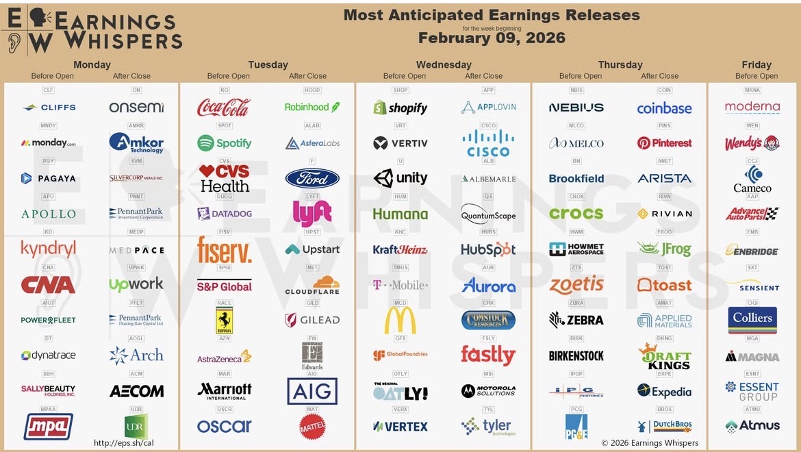
Quarterly figures 09.02-13.02.26
$UCG (+0,1%)
$MNDY (-6,09%)
$KER (-2,15%)
$BARC (+0,73%)
$OSCR (-2,17%)
$CVS (+0,01%)
$SPOT (+0,06%)
$DDOG (+5,08%)
$BP. (+1,56%)
$SPGI (-0,13%)
$HAS (-1,12%)
$KO (-1,66%)
$JMIA (+0,68%)
$MAR (-0,87%)
$RACE (-1,37%)
$UPST (+0,79%)
$NET (+3,82%)
$LYFT (-0,55%)
$981
$NCH2 (-0,63%)
$DSY (-1,2%)
$1SXP (-1,33%)
$HEIA (+0,01%)
$ENR (+3,22%)
$DOU (-0,68%)
$OTLY (-2,84%)
$TMUS (-0,52%)
$SHOP (+0,53%)
$KHC (-0,95%)
$FSLY (+3,3%)
$HUBS (-3,67%)
$CSCO (-1,88%)
$APP (+0,41%)
$SIE (+0,44%)
$RMS (-0,33%)
$BATS (-1,35%)
$MBG (+2,23%)
$TKA (+1,1%)
$VBK (+1,69%)
$DB1 (+0,06%)
$NBIS (-7,08%)
$ALB (+1,83%)
$BIRK (-0,89%)
$ADYEN (-1,44%)
$ANET (+0,62%)
$PINS (-1,01%)
$AMAT (+3,45%)
$ABNB (+0,29%)
$TWLO (+0,81%)
$RIVN (+0,53%)
$COIN (+2,61%)
$TOM (+3,6%)
$OR (-0,54%)
$MRNA (+0,6%)
$CCO (+0,85%)
$DKNG (-4,95%)


Will the sell-off continue next week?
$MNDY (-6,09%)
$PGY
$APO (+0,53%)
$ON (+3,3%)
$AMKR (+7,21%)
$MEDP (+1,73%)
$UPWK (-1,25%)
$ACGL (-2,49%)
$ACM (+0%)
$KO (-1,66%)
$SPOT (+0,06%)
$CVS (+0,01%)
$DDOG (+5,08%)
$FI (-3,43%)
$SPGI (-0,13%)
$RACE (-1,37%)
$AZN (-3,21%)
$MAR (-0,87%)
$OSCR (-2,17%)
$HOOD (+3,02%)
$ALAB (+0%)
$F (+0,16%)
$LYFT (-0,55%)
$UPST (+0,79%)
$NET (+3,82%)
$GILD (-0,31%)
$EW (-2,5%)
$SHOP (+0,53%)
$VRT (-0,98%)
$HUM (+0,56%)
$KHC (-0,95%)
$MCD (-1,61%)
$9ZX1
$TMUS (-0,52%)
$APP (+0,41%)
$CSCO (-1,88%)
$ALB (+1,83%)
$HUBS (-3,67%)
$TYL (-4,82%)
$NBIS (-7,08%)
$BN (-1,23%)
$CROX (+0%)
$ZTS (-1,91%)
$BIRK (-0,89%)
$COIN (+2,61%)
$ANET (+0,62%)
$RIVN (+0,53%)
$TOST (-0,65%)
$AMAT (+3,45%)
$DKNG (-4,95%)
$WEN (-0,91%)
$CCO (+0,85%)
$ENB (+1,1%)
Títulos em alta
Principais criadores desta semana