1Yr·

What do you like better / is clearer:


🚀 = Only relative return, but larger (can be switched to absolute by clicking on it)

❤️ = Relative + absolute return, but smaller font size

attachment
attachment
237
19 Comments

profile image
Relative + absolute ❤️
12
Have to agree. The white buttons are annoying in dark mode. Regarding the question: I could live with the smaller font. But it is not necessarily a feature that has to be there.
5
profile image
had to read 3 times before I understood what you want from us 😅
2
profile image
Relative + absolute is great. PS: The complaints about the "so very annoying buttons" I can understand but there are really worse....
2
@christian Thank you for asking your customers what they like better about GUI changes. I am still shocked by the Trade Republic update and thought afterwards: If something like that would happen at GQ, I would be really screwed, because I would not be able to control my portfolio anymore.
2
profile image
Getquin does not commit Trade Republic mistakes :D #vorhermalfragen
1
profile image
Let everyone customize their dashboard, then everyone gets something out of it :)
1
profile image
Relative & absolute is my favorite. One less click because I don't have to switch.
1
profile image
❤️
profile image
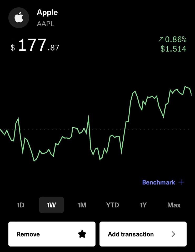
with the variant with both values at the same time, does one also see the absolute development during the changeover? can one somehow superimpose the transatctions on the perforence chart?
profile image
Relative + Absolute in any case and please get rid of the white button 🙈
profile image
The 2.
profile image
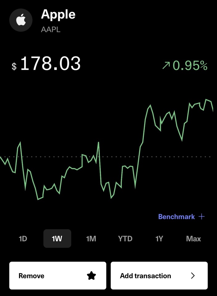
I'm always happy to have as much information as possible at a glance, without having to do a lot of clicking or swiping. I think all those who invest should be able to cognitively process this "information input" at once. Huge buttons don't help anyone and only waste space unnecessarily.
profile image
And please get rid of those blue buttons with the gift etc on the bottom right. This is so intrusive and annoying
profile image
The left image WITHOUT white buttons please; this is called Dark Mode not Black and White Mode.
Join the conversation