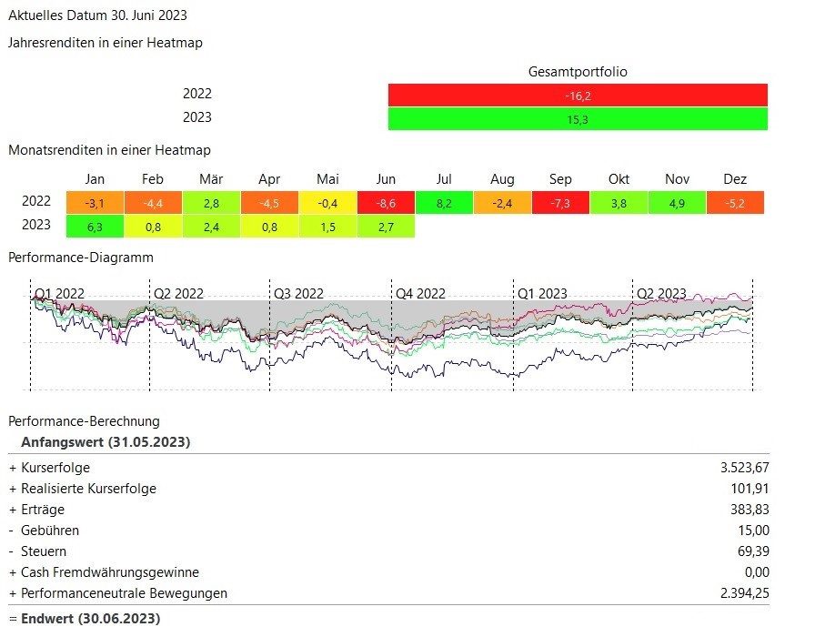
The month of June is drawing to a close. It was a good month on the stock market - a plus of around 2.7% - compared to 2022 (-8.6%)
not much is missing and the "losses" of 2022 are equalized.
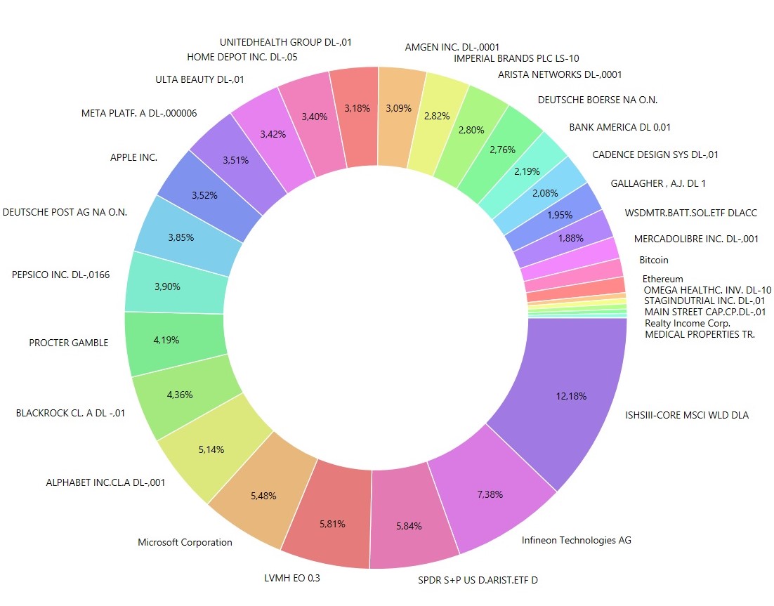
Some positions have changed.
$ALV (+0,24 %) was sold and replaced by $AJG (+0,26 %) replaced by
$ULVR (-3,21 %) was replaced by $PEP (-1,87 %) replaced.
$TSM (-2,41 %) was sold and $MELI (-2,41 %) & $CDNS (-1,21 %) are new in the depot.
.... a little bit here and a little bit there was added.